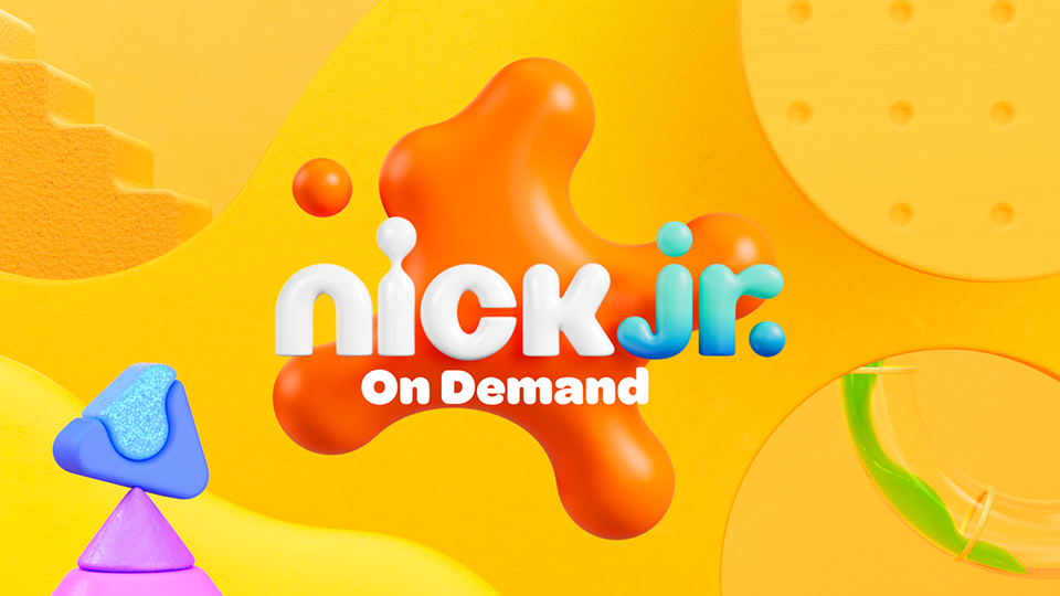
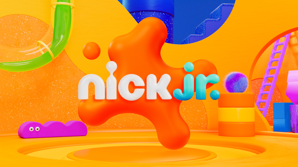
Nick Jr. Rebrand 2024
Designing the Playroom:
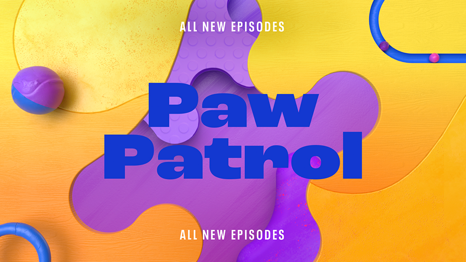
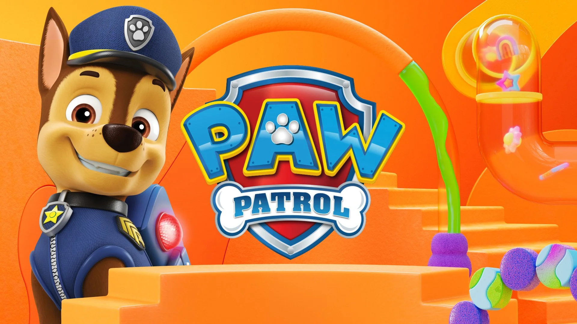
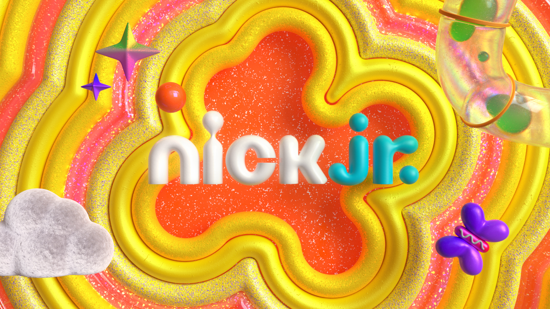
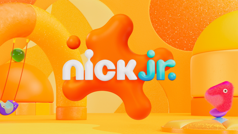
A unified system for Nick Jr.
A modular identity built across broadcast, digital, social, and OOH
I led the system architecture for the 2024 Nick Jr. rebrand, transforming fragmented visuals into a cohesive Playroom identity. Collaborating with the external vendor Roger, I rebuilt the color, material, type, and motion logic into a unified framework that scales across campaigns, seasonal initiatives, and new show launches.
My Role
Senior Brand Motion Designer
(Design Lead for System Development)
Scope:
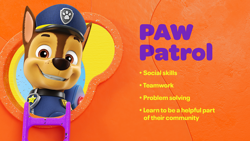
System architecture, visual identity, motion language, Playroom world creation, platform adaptation, AE toolkit development
Responsibilities:
Led the system development of the Nick Jr. 2024 identity
and expanded it across campaigns and platforms.Built a modular framework for color, materials, icons, typography, and motion.
Designed the Playroom visual environment and defined its tactile
and behavioral rules.Partnered with Roger to align visual direction and streamline production.
• Problem Definition
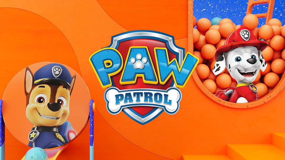
When Nickelodeon’s new splat system was applied directly to Nick Jr., the preschool identity weakened. The neon palette (orange, purple, and slime green) overpowered Nick Jr.’s warm yellow tone, and essential recognition cues such as the friendly logo silhouette and character-first layout were diminished. For preschoolers, these cues are critical for identifying shows, so clarity and brand recall became compromised.
The use of hard plastic and wooden textures shifted the aesthetic toward baby toys rather than a tactile, imaginative world designed for ages 2 to 7. The overall visuals became flat, cold, and misaligned with Nick Jr.’s established personality.
The core issue was an audience mismatch. While Nickelodeon speaks to ages 6 to 17 with bold, high-energy visuals, Nick Jr. requires a soft, safe, imagination-driven environment tailored specifically to preschoolers. This gap made a complete redesign necessary to restore warmth, clarity, and preschool-appropriate storytelling.
Before — What Wasn’t Working
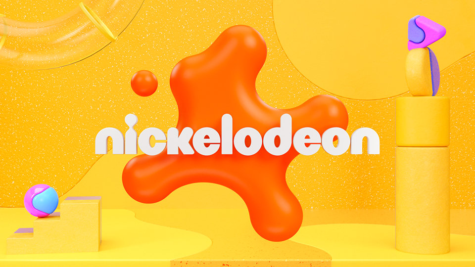
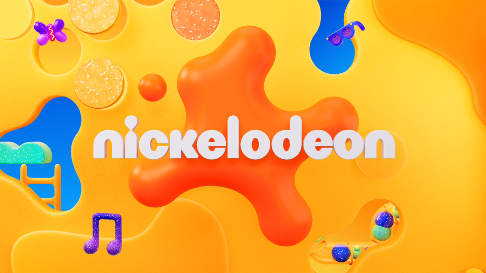
Nickelodeon New Brand System Key Visual
Nick Jr. Early Round
2. Flat layouts without character and logo
presence, weakening show recognition.
3. Hard plastic and wooden textures that
felt like baby toys and lacked preschool
appropriate tactility.
Nickelodeon speaks to older kids with a bold, high-energy visual system built from neon colors and fast-paced motion. Nick Jr., however, needs a softer, tactile, imagination-driven world designed for ages 2 to 7. This fundamental difference in audience and purpose required a system that could reinterpret the parent brand while restoring Nick Jr.’s warmth and clarity.
These differences defined exactly what the new system needed to solve. We began rebuilding Nick Jr. with a preschool-first logic across color, materials, layout, and motion, creating an environment that is soft, safe, and imagination-driven.
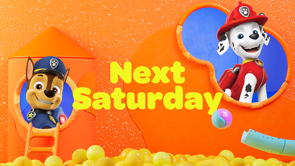
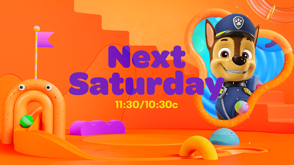
After Example
2. A clear, character-led composition that helps
preschoolers instantly recognize their
favorite shows.
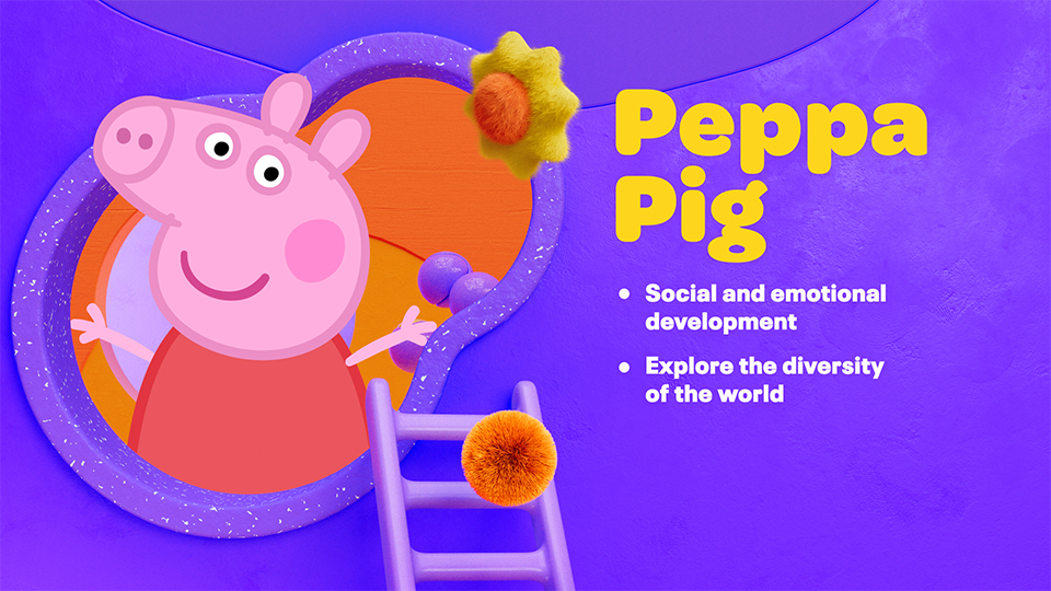
3. Soft, tactile surfaces rebuild the Playroom
feel, replacing cold plastics with materials
that spark imagination.
1. Nick Jr.’s iconic warm yellow tone lost
within Nickelodeon(Big Nick)’s color
transitions.
1. A warm, cohesive palette that brings back
Nick Jr.’s signature tone and reconnects the
brand to its preschool audience.
Strategic Differences (Nickelodeon vs Nick Jr.)
Nickelodeon (Big Nick)
Audience: Ages 6–17
Tone: Bold, high-energy, fast-paced
Color System: Neon-driven palette (orange, purple, slime green)
Visual Language: Strong contrast, graphic compositions
Focus: Entertainment, humor, dynamic action
Nick Jr.
Audience: Ages 2–6
Tone: Soft, safe, imagination-driven
Color System: Warm primary palette built around iconic orange and yellow
Material: Tactile surfaces (rubber, felt, matte plastic, slime gloss)
Layout: Character- and logo-first for quick preschool recognition
Focus: Learning, comfort, simple storytelling
• Process:
A system-first workflow built to restore clarity, warmth, and preschool identity.
Step 1 — Rebuild the Logo Foundation
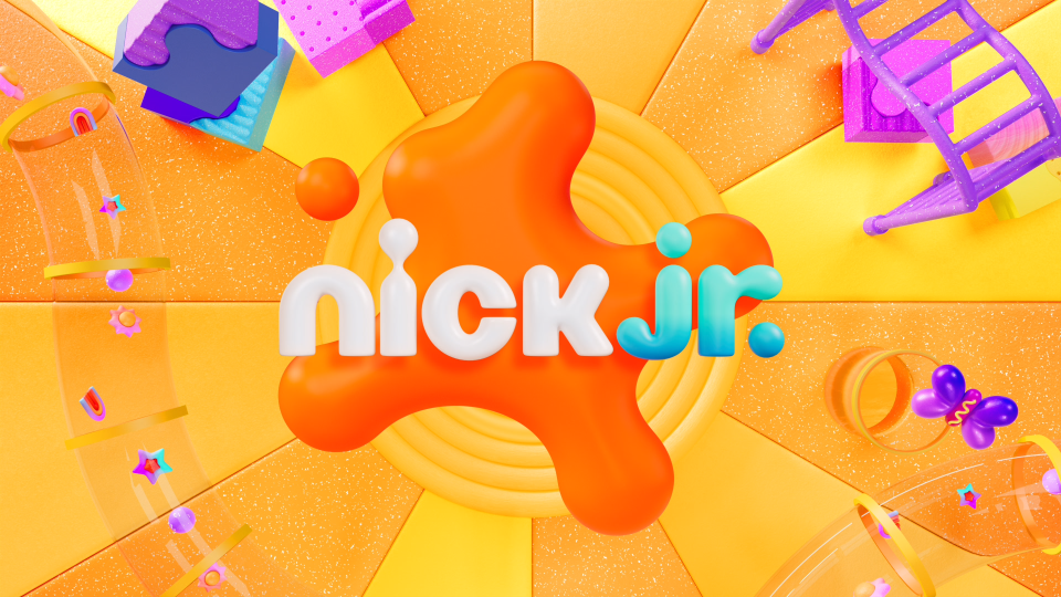
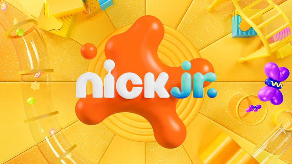
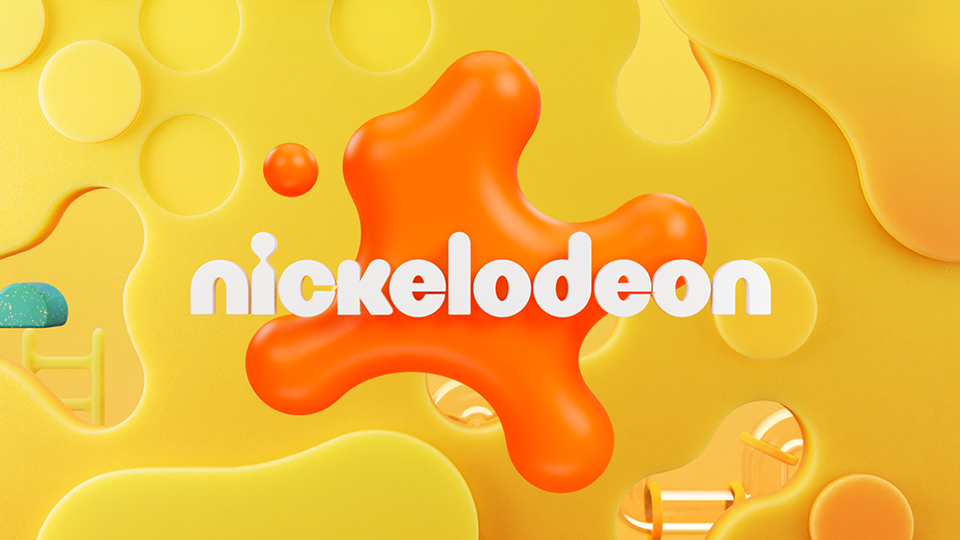
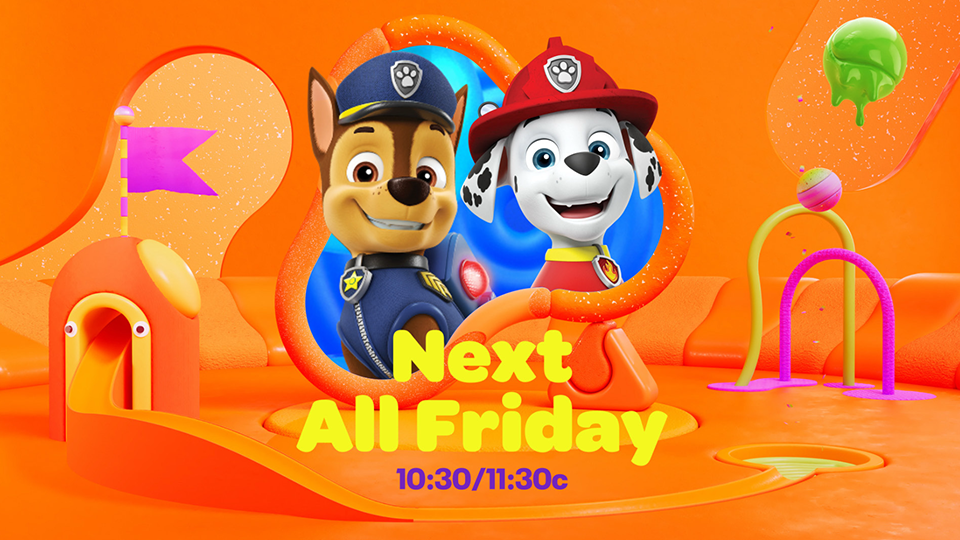
We began by rebuilding the logo foundation, integrating Nickelodeon’s new splat identity into the original Nick Jr. 3D mark. This step created a clear visual bridge between the parent brand and the preschool identity. The redesigned logo became the anchor for the entire system, informing the overall tone for lighting, texture, color behavior, and spatial composition.
Before → After


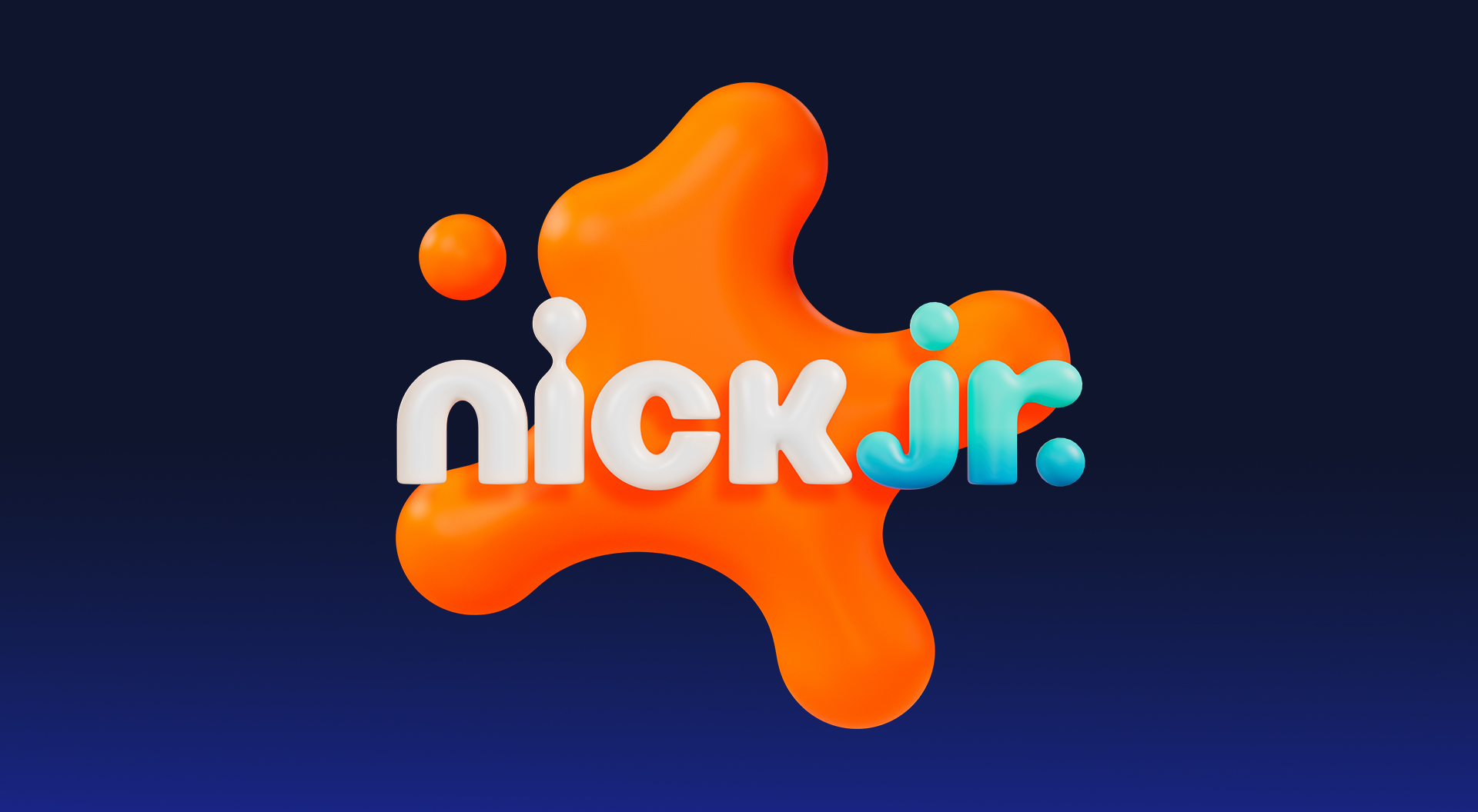
Updated integrated 3D Nick Jr. logo
Before Nick Jr. logo + Big Nick splat
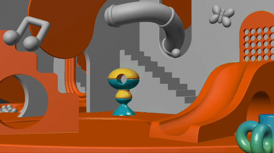
We rebuilt the Playroom environment by refining color, layout, materials, and spatial rules.
Each iteration clarified what preschoolers needed: clearer hierarchy, warmer tones, tactile surfaces, and strong character presence.
Here is how the environment evolved across key stages:
Step 2 — Build the Playroom Environment

Before
Before
A. Palette & Icon System Refinement
Issue: The early frame felt overly monochromatic. Yellow dominated without balanced accents, and the environment lacked playful preschool icons.
Solution: Introduced a warm, approachable palette anchored in Nick Jr.’s iconic orange and yellow, supported by gentle accent colors and simple Playroom iconography.
Before
After
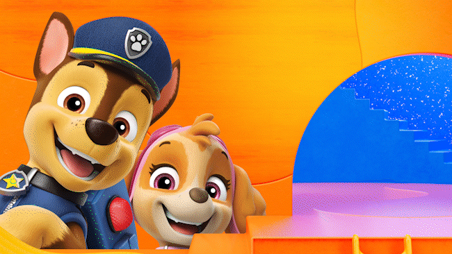
B. Character & Layout Hierarchy
Issue: Characters appeared too small, without a clear place to anchor them. The frame needed a strong holding shape and a large cropped character to support quick recognition for preschoolers.
Solution: Designed a soft, imagination-driven layout with clear character-first hierarchy and large, readable holding shapes that support logo, type, and character placement.
After
C. Material & Texture Redesign
Issue: Hard plastic and wooden textures felt cold and toy-like, and the background lacked tactile warmth or spatial interest.
Solution: Replaced rigid materials with soft, tactile textures such as fur, rubber, felt, and matte plastics, adding playful icons and subtle motion cues to enhance the Playroom sensibility.
After
First Round Issues
The initial Playroom exploration had good spatial potential, but the layout did not support preschool communication.
There were no clear holding shapes for logos, tags, or characters, and the bright accent colors and busy patterns distracted from the Nick Jr. tone.
Palette & Layout Refinement
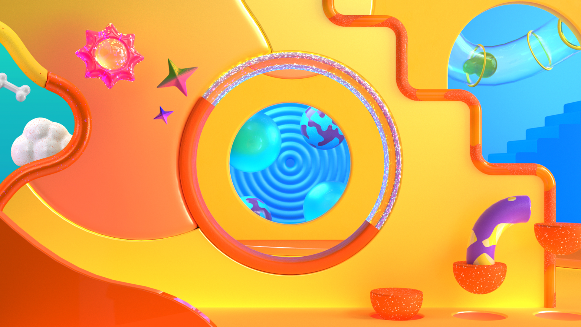
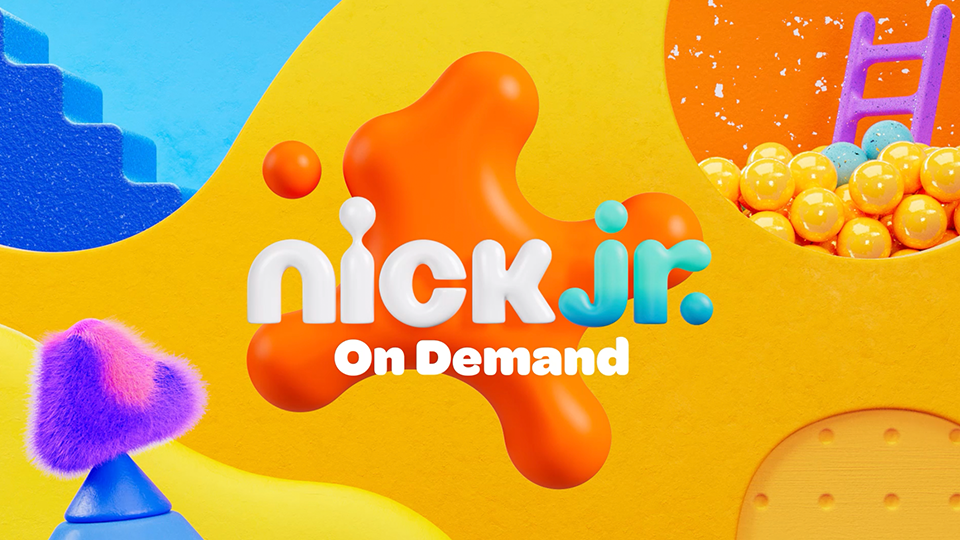
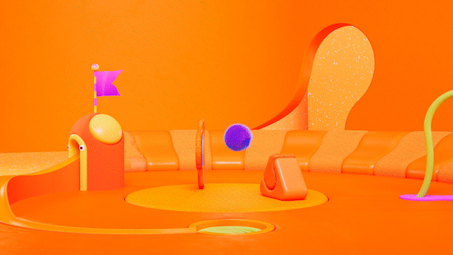
Final Playroom Environment (After)
A warm, tactile, imagination-driven world that restores Nick Jr.’s preschool identity with clarity and modern consistency.
STEP 3 — Define the Scalable System (Color, Type, Motion)
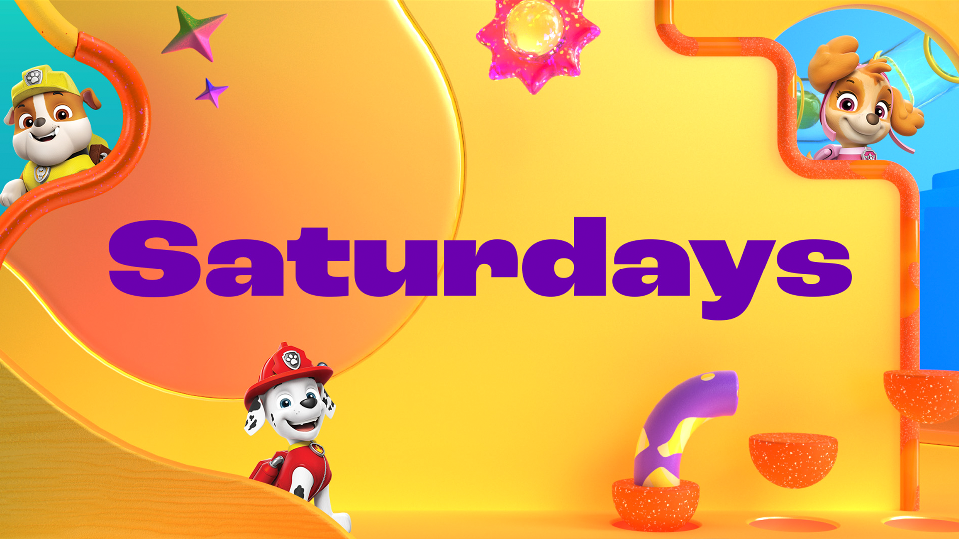
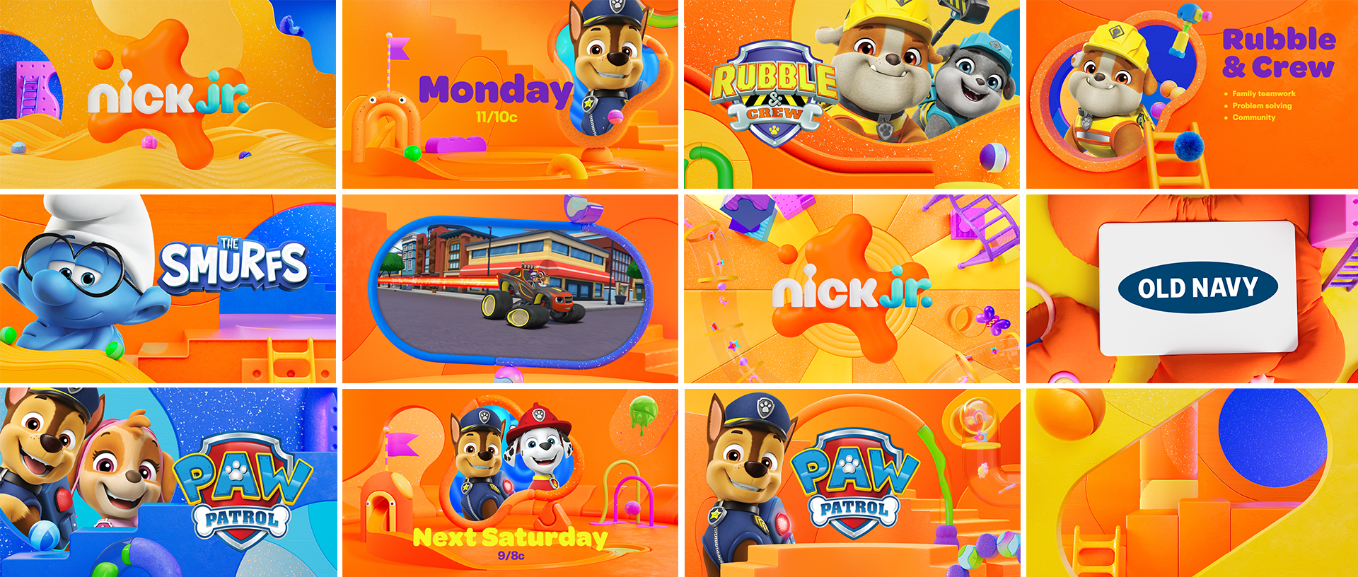
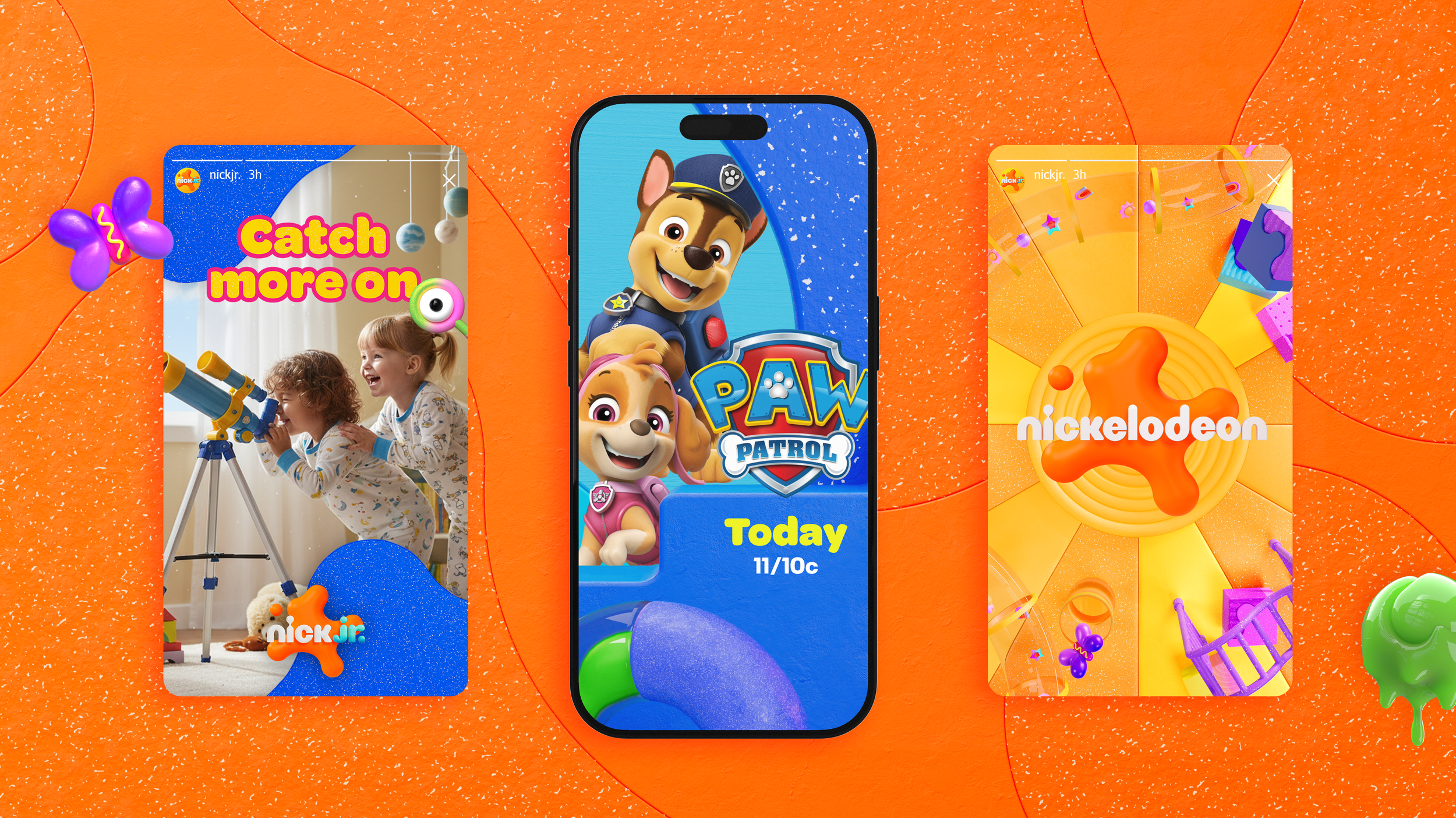
Building on the Playroom foundation, we created a scalable system across color, materials, typography, and motion. Each element was modularized into reusable rules that ensure consistency across broadcast, digital, social, OOH, and seasonal campaigns.
A) Color & Material System
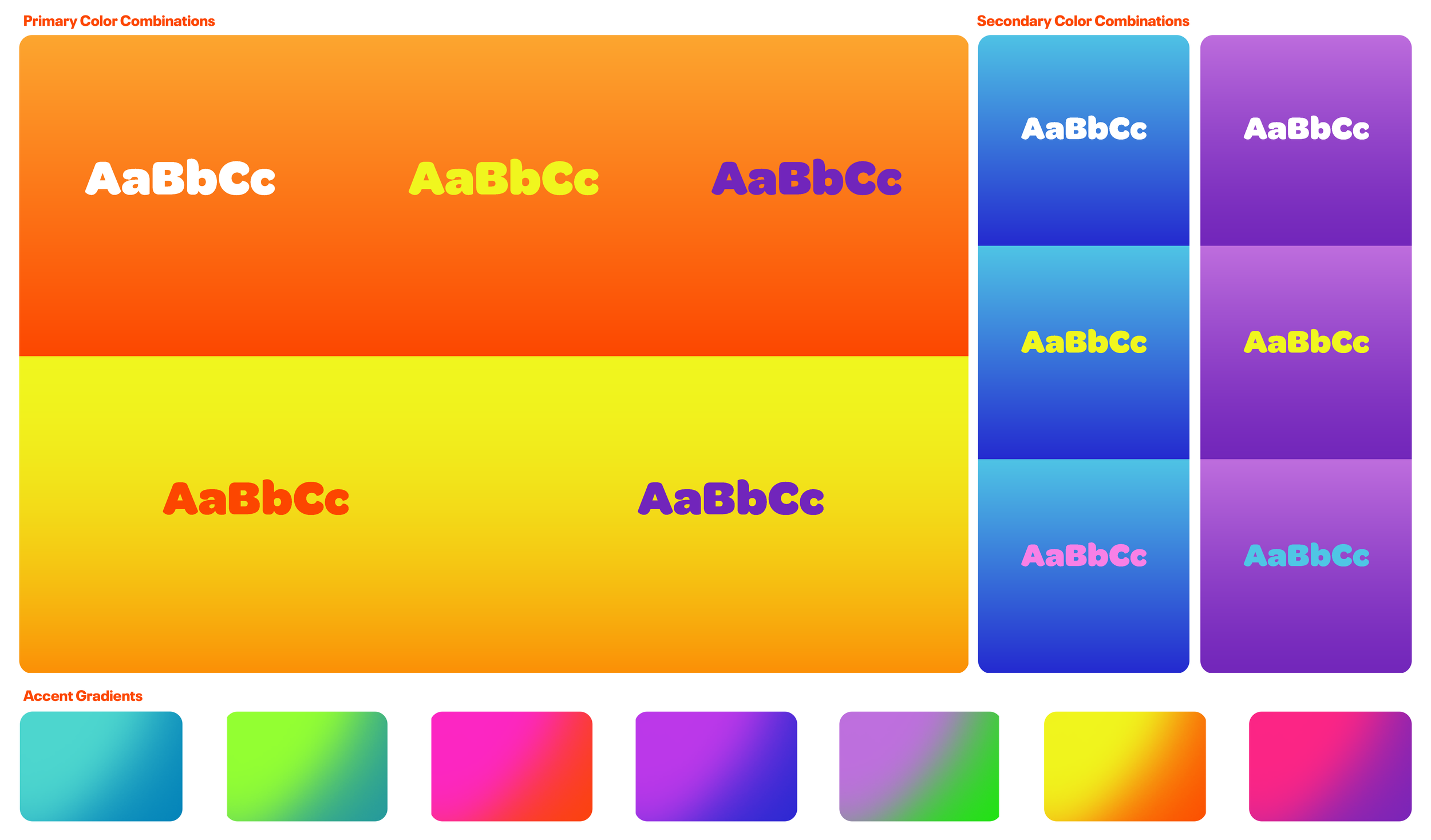
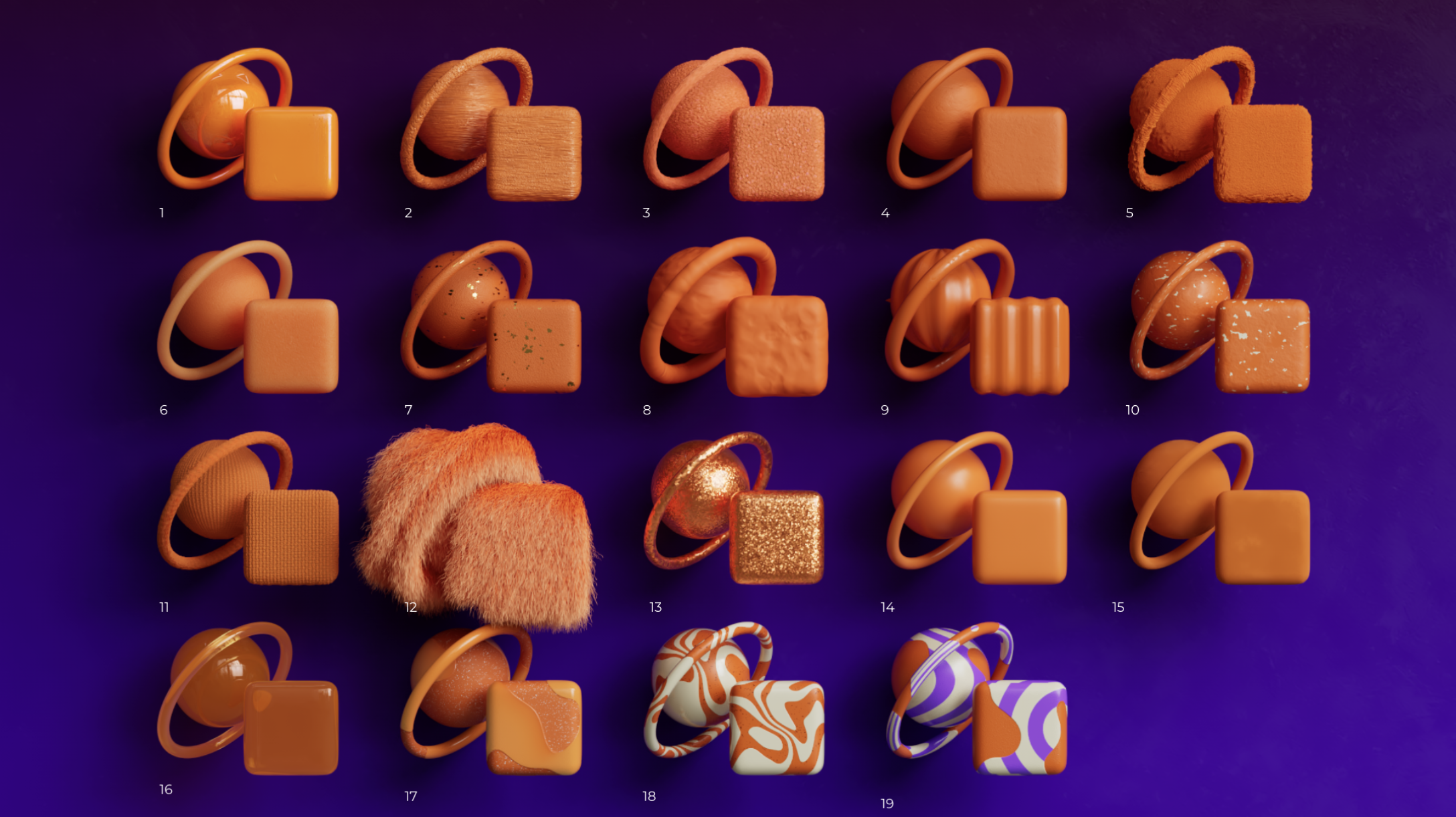
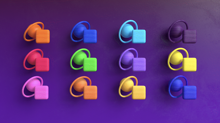
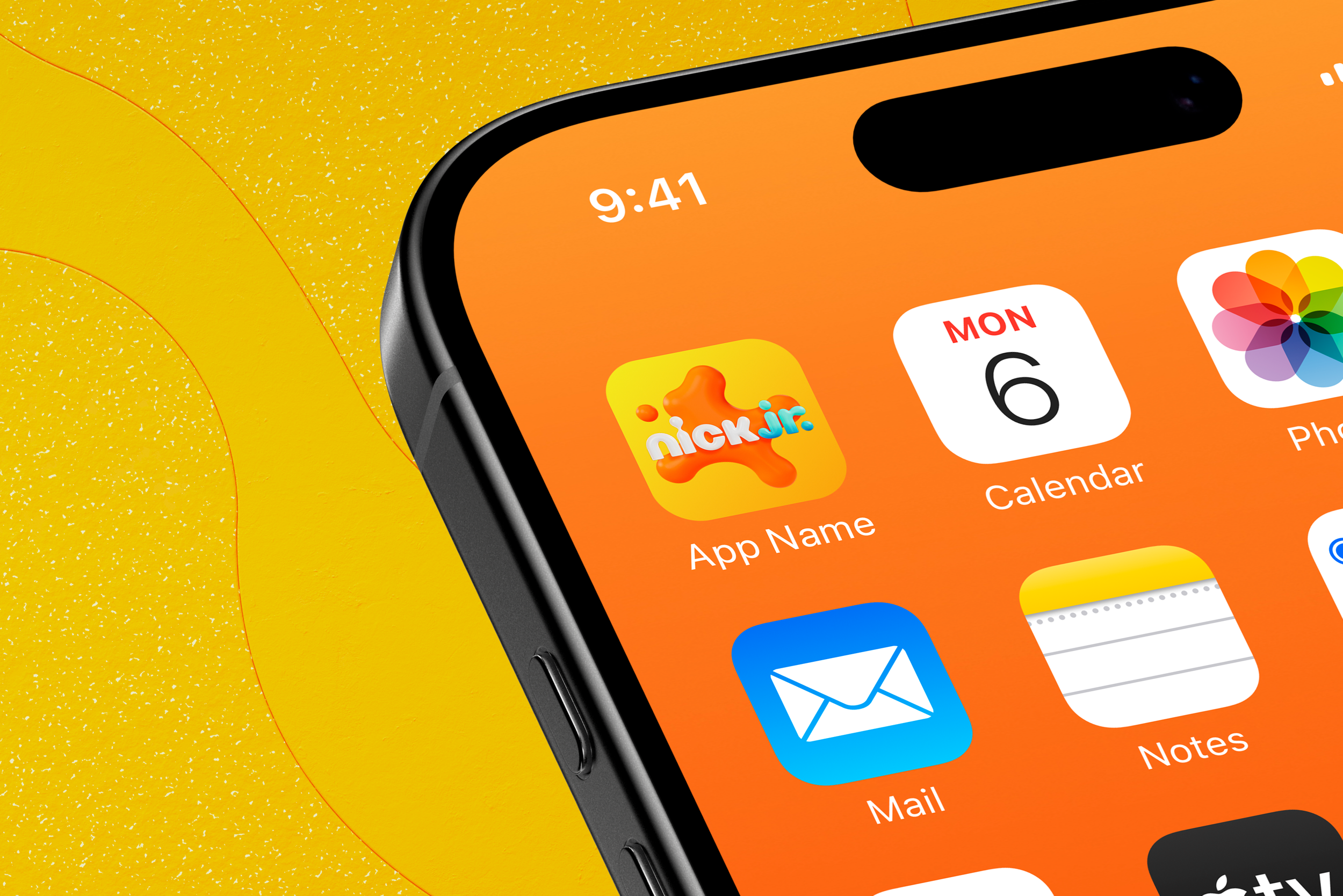
Nick Jr.’s system begins with a warm, preschool-first palette built around its iconic orange and yellow. Accent colors were expanded from Nickelodeon’s splat world, creating consistency with the parent brand while keeping a softer preschool tone.
Tactile materials such as rubber, felt, matte plastic, and slime gloss replace flat surfaces, restoring the warmth and sensory clarity needed for ages 2 to 7.
B) Typography System
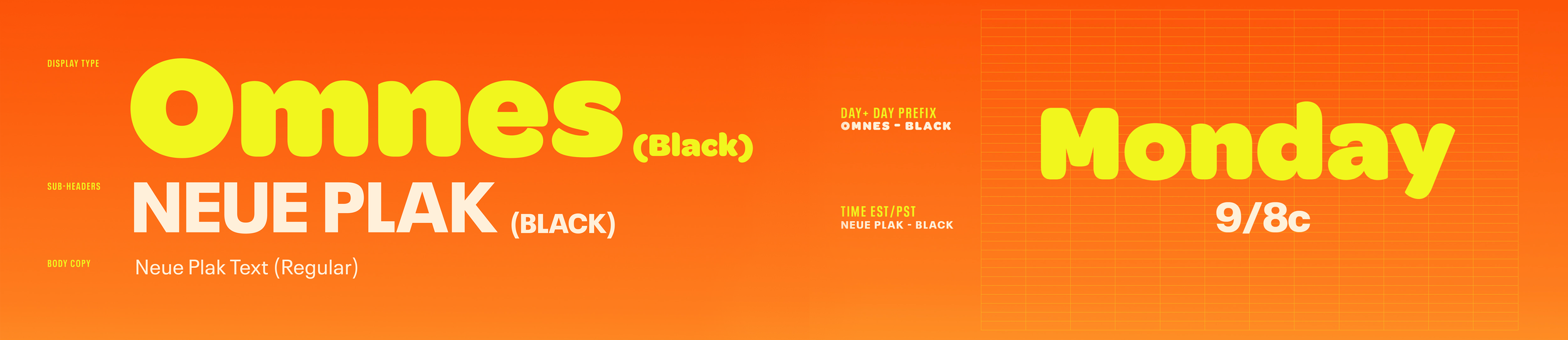
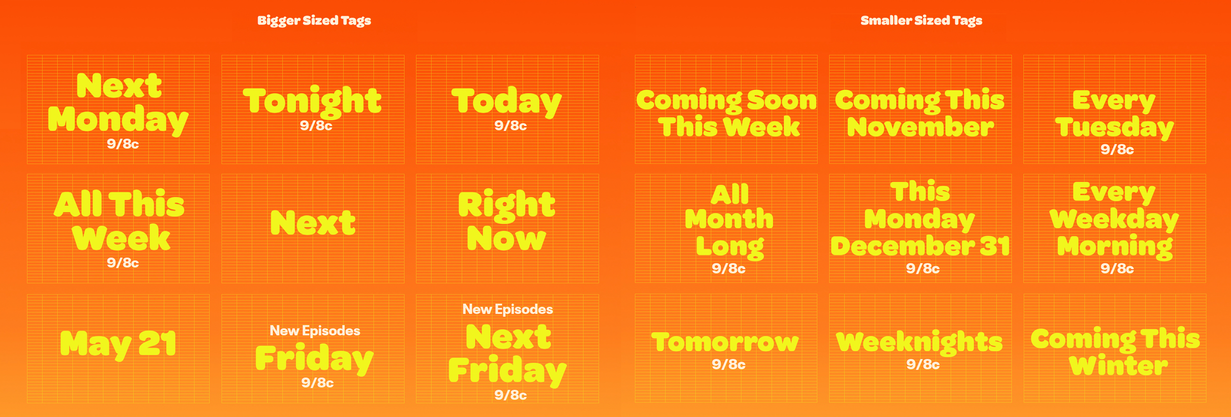
Typography Layout Samples in Various Sizes and Styles
Nick Jr.’s typography system combines Omnes and Neue Plak to balance preschool friendliness with structural clarity.
Omnes Black, used for display headlines, brings warmth through rounded curves and soft geometry, making titles approachable and expressive for young audiences.
Neue Plak provides the necessary structure for subheads and body copy with its clean, geometric forms and high legibility.
Together, the two typefaces create a clear hierarchy that scales across broadcast graphics, educational messaging, digital platforms, and fast-paced social formats. The pairing ensures that every message feels playful yet organized, supporting Nick Jr.’s identity as a safe, joyful, and easy-to-understand preschool brand.
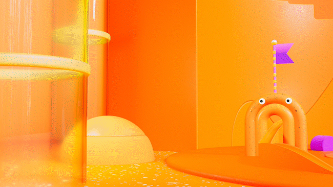
C) Motion System
The motion system extends the Playroom identity into soft, elastic behaviors inspired by splat-like forms. Each action follows rounded easing, gentle bounce timing, and organic mask transitions that create a warm, tactile rhythm appropriate for preschool audiences.
Motion rules are modular and reusable across all formats. Titles, lower thirds, interstitials, and social templates share the same timing logic and compositional flow, allowing the system to scale consistently across broadcast, digital, and short-form vertical content.
This unified behavior ensures that every movement feels calm, friendly, and imagination-driven while maintaining production efficiency for both internal and external teams.
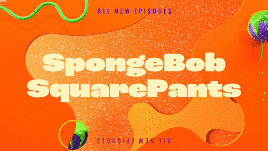
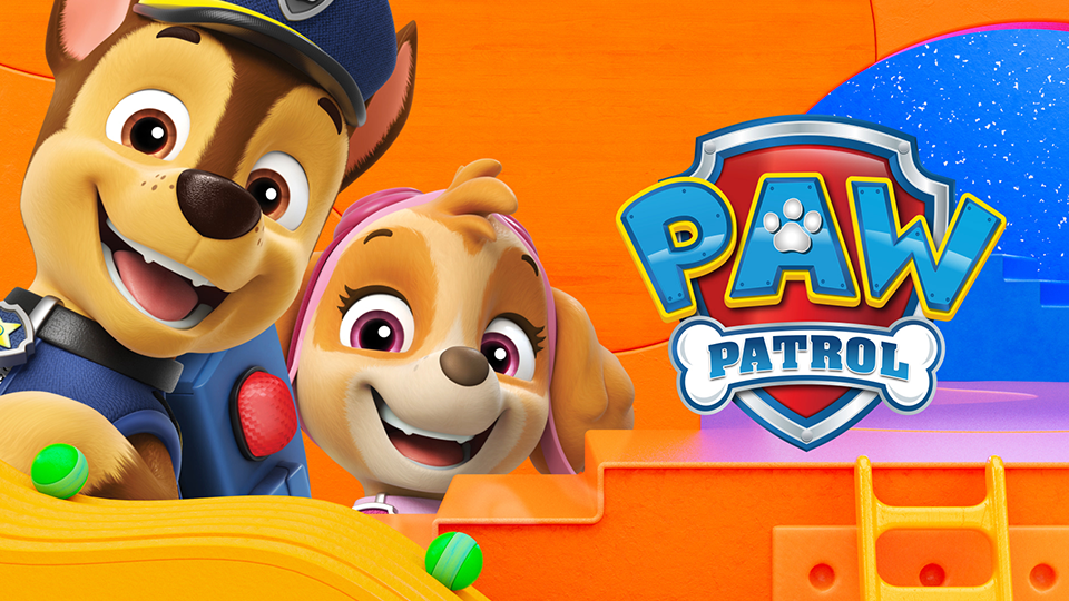
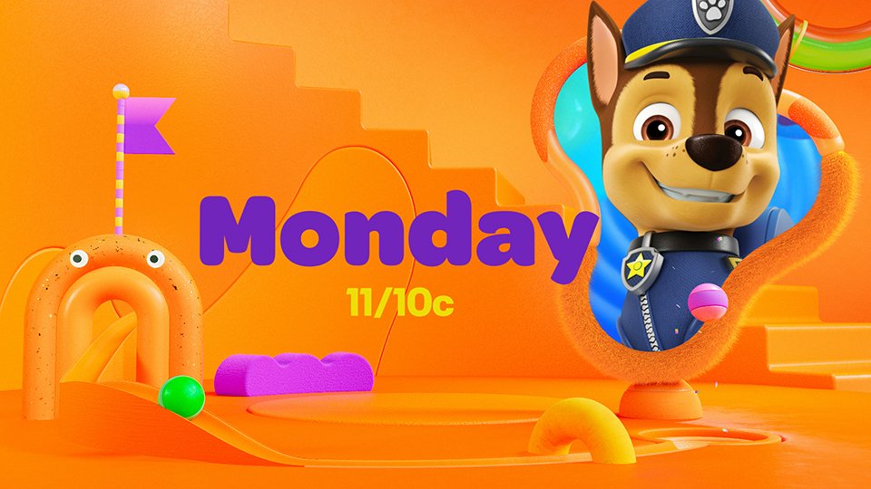
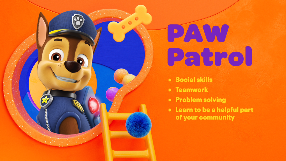
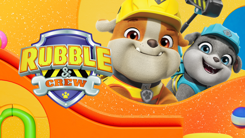
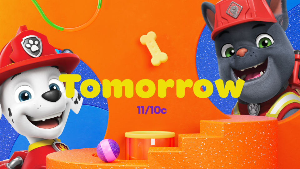
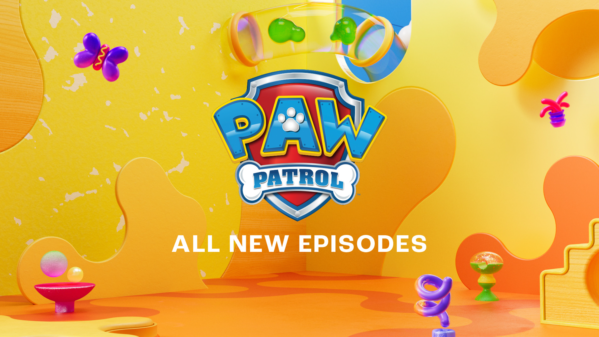
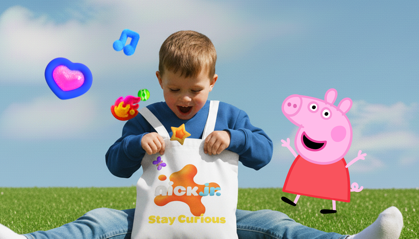
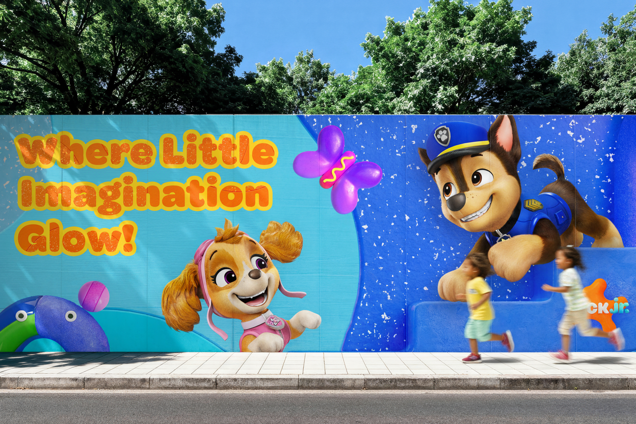
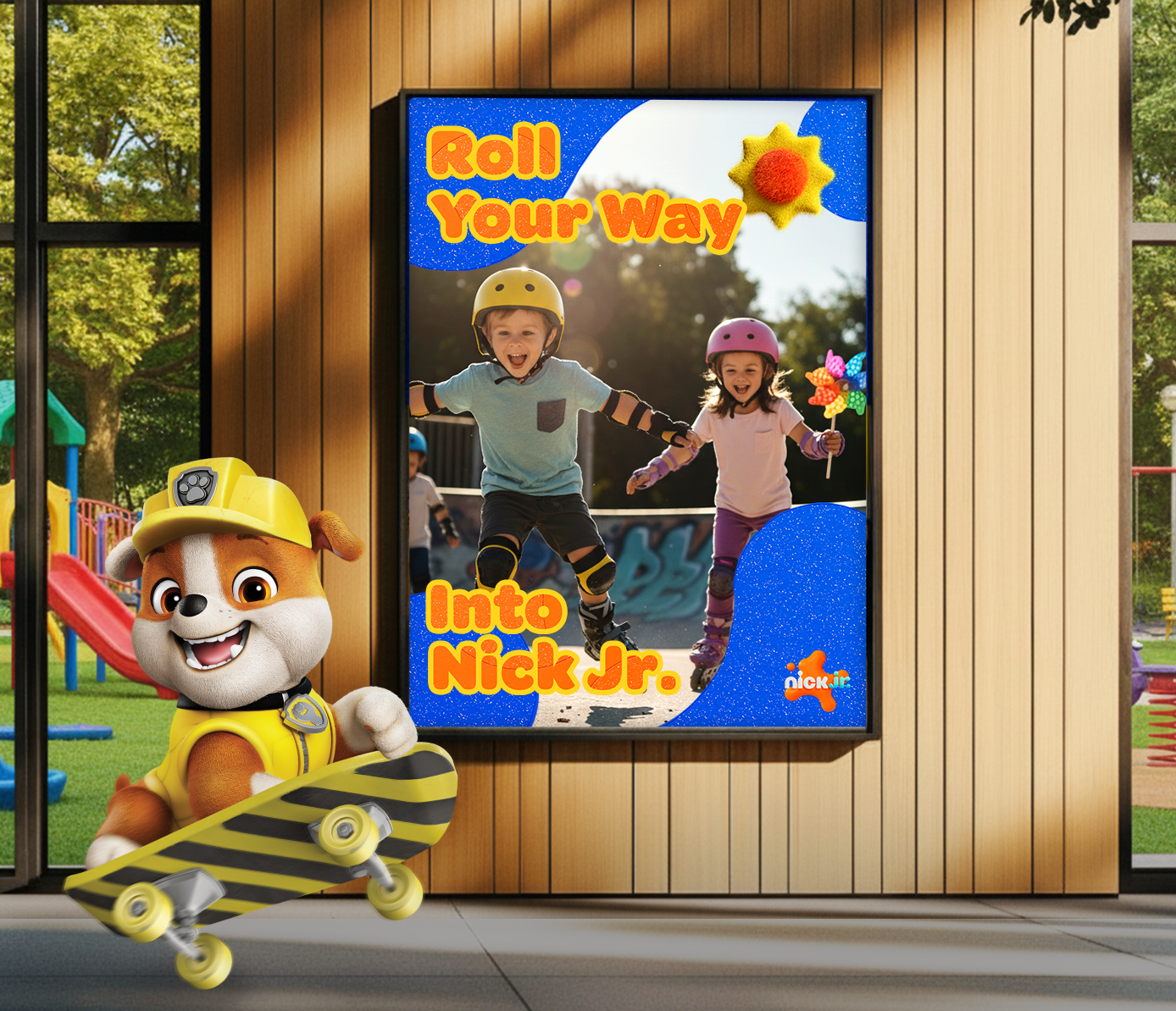
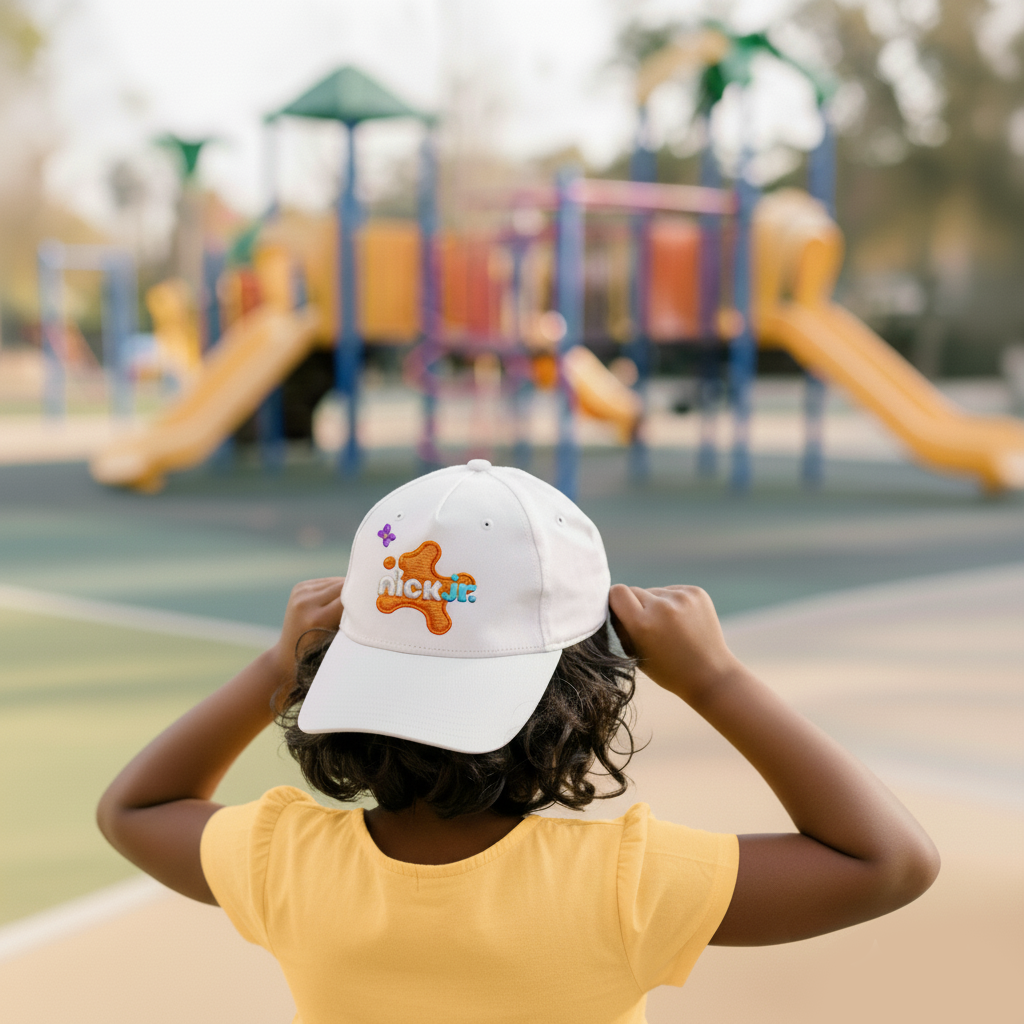
Applications
Credits
Senior Motion Designer: Jimin Lee
SVP Brand design: Michael Waldron Design Director: JungIn Yun. Senior Designer: Thanh Nguyen Motion Designer: Seulgi Kim, Minha Kim Junior Designer: Marissa Klick
Animation Director: Rob Kohr
VP Animation & Motion Graphics: Kurt Hartman.
Sr. Producer: Michelle Glenn, Jennifer Treuting Design/Animation/Production: Roger
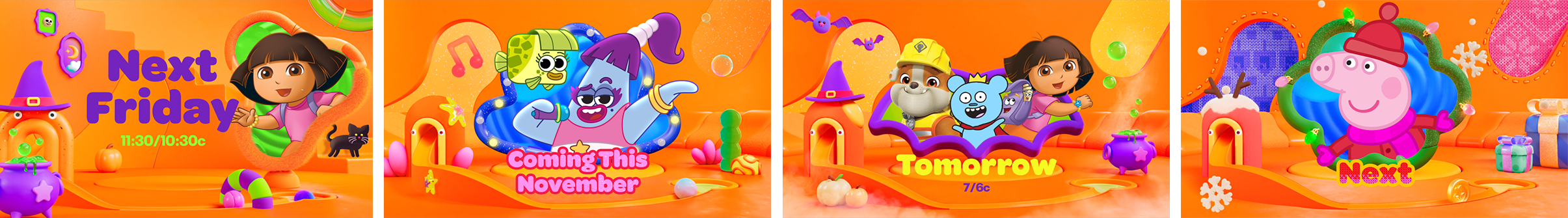
Seasonal Campaign Adaptation
Holiday Graphic Refresh
Before — Core System
The original Nick Jr. rebrand package establishing the base rules for color, layout, texture, and motion.
The Nick Jr. system expanded into a festive “Sweater Weather” package through knitted textures, stitching details, and soft seasonal motifs. The color palette was adjusted from the core rebrand system to introduce a holiday tone while preserving the established rules for color, layout, and motion. The result is a warm, playful extension that remains true to the Nick Jr. identity.
I led the concept, visual development, graphic package design, and final animation.

Refreshed Graphic Package (After)
The “Sweater Weather” refresh adapts the core system into knitted textures, stitching details, and soft seasonal motifs while keeping the Nick Jr. tone fully intact.
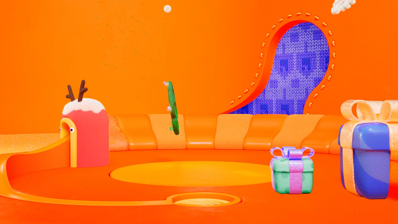

Holiday Icons


Credits
Senior Motion Designer: Jimin Lee
SVP Brand design: Michael Waldron
Senior Art Director: Jungin Yun
Art. Director: Kay Kyungjoo Lee
Animation Director: Rob Kohr
Associate Animation Director: Jason Willmann
Motion Designer: Seulgi Kim, Minha Kim
Animator: Annie Chien, Jennah Park
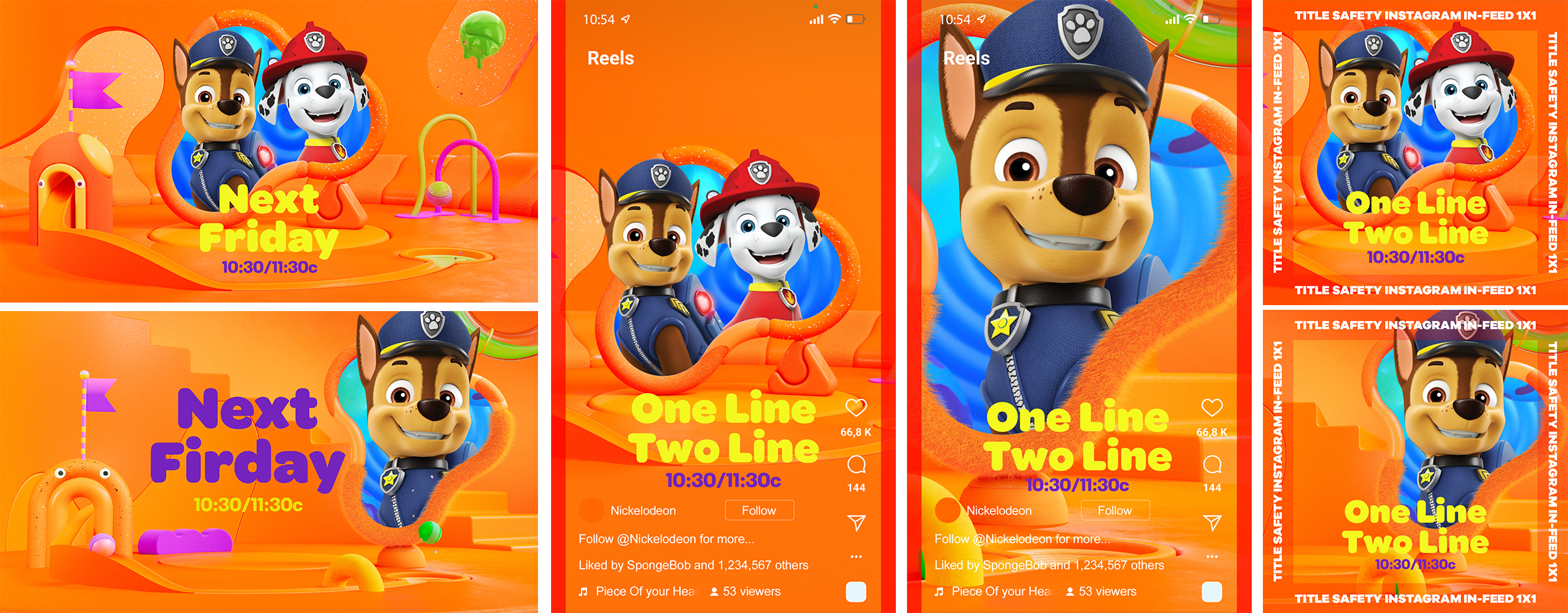
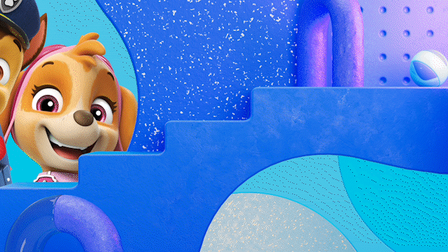
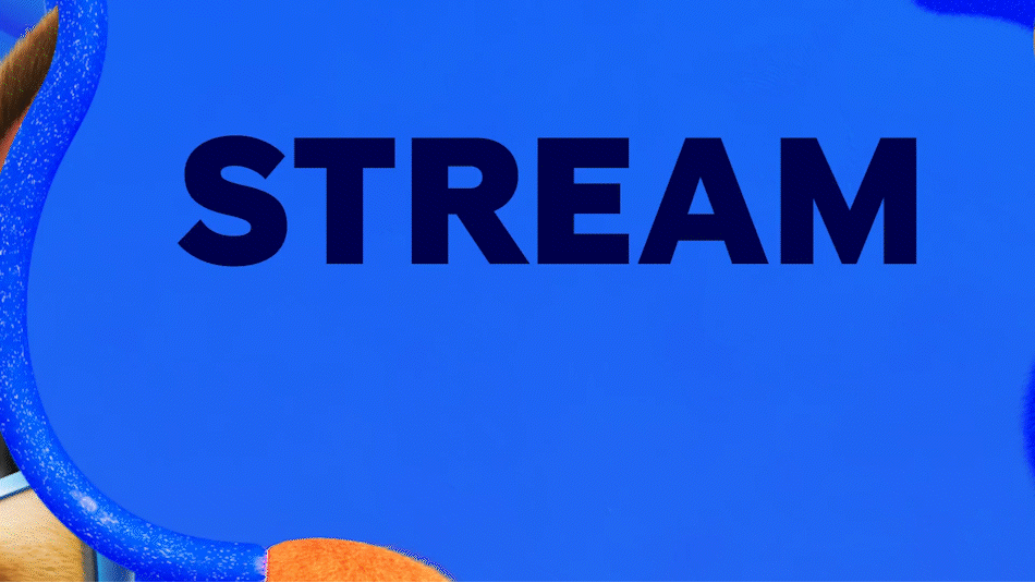
Cross-platform Adaptation
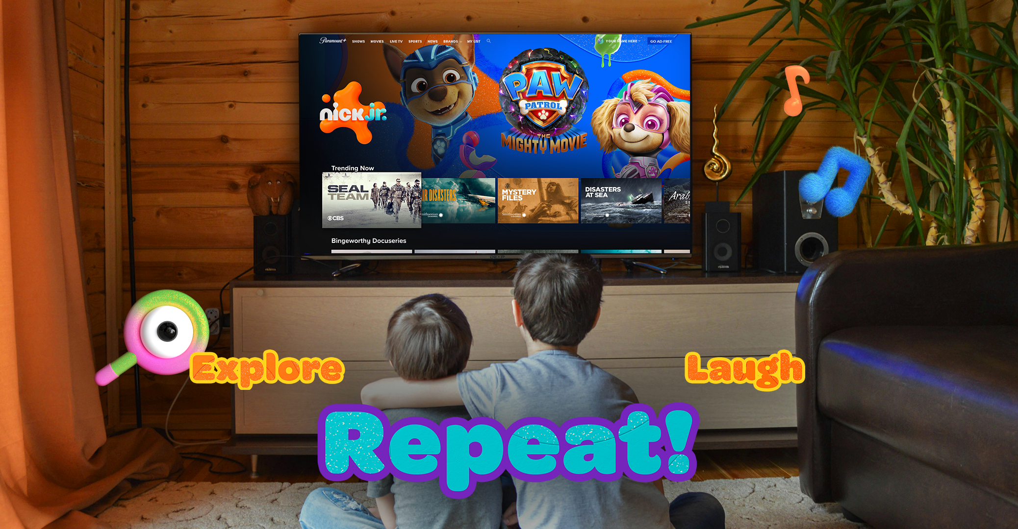
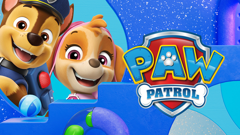
A platform-specific adaptation of the Nick Jr. system for Paramount+, combining platform clarity with a simplified, kid-friendly identity.
To promote Nickelodeon's preschool shows on Paramount+, we developed a custom graphic package blending the platform’s blue palette with Nick Jr.’s preschool identity. The visuals were simplified for a broader audience, creating a look that is clean, modern, and streaming-friendly.
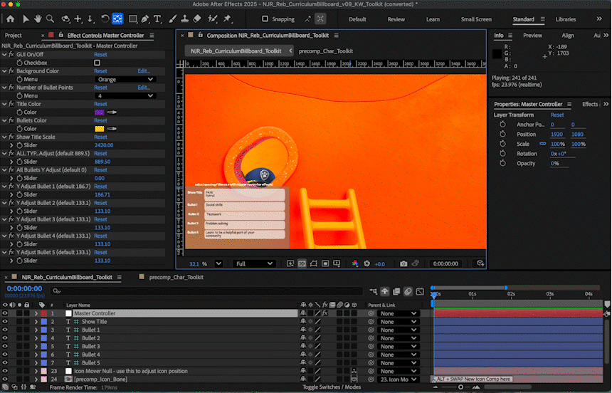
My role included designing and animating the package using rebrand 3D assets and adapting them to fit the platform’s visual system.
Paramount+ All Kids Spot:
Key Design Decisions
Blended the Paramount+ blue palette with Nick Jr.’s signature warmth to create a balanced cross-platform tone.
Combined the platform’s type system with Nick Jr.’s core rebrand colors, materials, icons, and character hierarchy for visual alignment.
Simplified layouts for clear comprehension across a broader audience that includes both kids and adults.
Reinterpreted 3D assets for platform clarity and modern streaming aesthetics.
Graphic Package


Credits
Senior Motion Designer: Jimin Lee
Senior Art Director: Jungin Yun
Animation Director: Rob Kohr
Senior Designer: Thanh Nguyen
Motion Designer: Seulgi Kim, Minha Kim
Animator: Katie Wynkoop